Thursday, 17 February 2011
Question 3: Ancillary Task


In our poster, we just show the main characters behind a completely black background. We looked at posters of the drama genre and found they usually focus on the characters. This poster for The Soloist for example focuses a lot on the characters, and the fact that someone's looking to the side show they are the ones with the main issues and they are usually the main character. However we decided to have less emphasis on the actors names and more emphasis on the films title, which appears at the end of our film.
We looked at real life reviews, especially for drama films like Kidulthood. We noticed that the layout was in columns and there was usually small important information about the film such as the film's stars and its release date. There are also many images from the film which shows what the film being reviewed looks like. We used this image because it shows most of the characters and this shot summarises the friendship between them all. For the review, we used the distinctive colour scheme of blues so that it is more interesting to look at. We also used a star rating which is a key way of showing at a glance how good the film is. We decided to use one column as we felt it looked neater and was easier to read.
Sunday, 13 February 2011
Tuesday, 25 January 2011
Making Production and Film Title
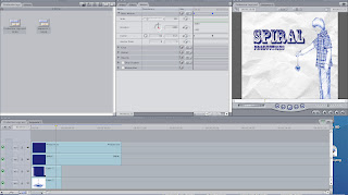
I firstly got an image from Google of a boy with a yoyo, which is going to be the production company logo. Because I wanted to animate the yoyo and have the boy static, I imported the image into Photoshop and split the image up into individual sections, which formed different layers. I then added a paper background and typed the production name next to it.
 I then saved the individual images and opened up Final Cut Express. I imported each of them and then openede up the Motions panel. I then animated the logo by moving the yoyo and the string pieces up and down. Afterwards I imported some copyright free music and added it on to the timeline. I trimmed it and faded it in and out along with the actual production title.
 I was initially going to make the Exodus title using LiveType but Final Cut was better as I could put it on the timeline straight away. I typed Exodus in white against a black background as we wanted it to be a simplistic and serious title. I seperated and stretched the letters to make it look more dramatic, and animated it to zoom and then fade out on the screen.
 I then saved the individual images and opened up Final Cut Express. I imported each of them and then openede up the Motions panel. I then animated the logo by moving the yoyo and the string pieces up and down. Afterwards I imported some copyright free music and added it on to the timeline. I trimmed it and faded it in and out along with the actual production title.
 I was initially going to make the Exodus title using LiveType but Final Cut was better as I could put it on the timeline straight away. I typed Exodus in white against a black background as we wanted it to be a simplistic and serious title. I seperated and stretched the letters to make it look more dramatic, and animated it to zoom and then fade out on the screen.
Subscribe to:
Comments (Atom)


